Lovense is known for many things, mostly its teledildonic tech. But one that I think that gets overlooked is the way it uses customer feedback – particularly when it comes to updating a previous generation toy.
Yes, I know it sounds like a company plug. But take it from someone who’s seen the product go from concept to shipping; the feedback is actually heard.
Let’s take LUSH 3 for example.
The bright pink, wearable love egg is now in its third generation.
How has it evolved?
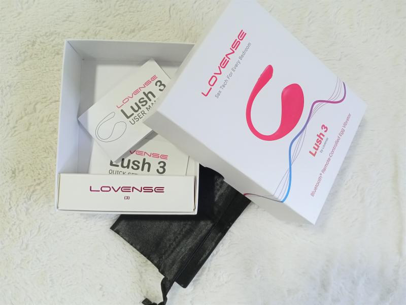
THE PACKAGING
Other than the new style branding, the packaging hasn’t gone through many changes – mostly because there wasn’t a need for it. BUT, they have started to add black satin baggies to go with every toy, which is great (and muchly needed).

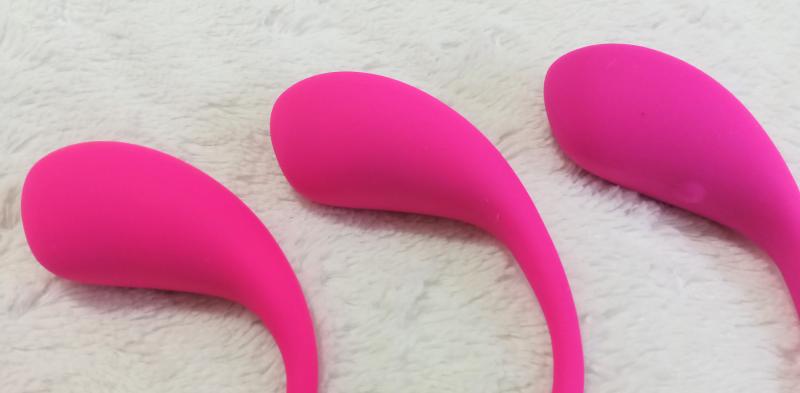
THE BULB
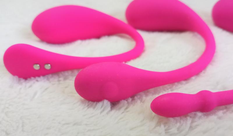
The general shape of the bulb has also stayed pretty much the same (save a few millimeter tweaks here and there). The biggest change comes from where the power button is/was located. After the first version, they quickly learned (from their customers). For example, having the power button INSIDE you made it, you know, kind of hard to turn on/off.
Another useful difference is where the charging port is located.
Originally, it was on the side of the bulb and you had to stick the charging pin in it. Lush 1 was still waterproof, but if you were like me, I had heart palpitations every time I had to stick it in (yes, there’s a joke there). I had a panic attack about the internal tube or pin getting broken in some way. It also didn’t help that there was a warning about “not pushing the pin in too hard.”
It was the same when it changed to the second version. But by the third, the power button and charging port had moved from the bulb to the end “nub” (or whatever it’s called).

THE END
Aside from the power button, the charging port is now a magnetic clip – which saves everyone a lot of stress.
I think Lovense waited so long to make this change because they needed to find hardware that would be strong yet small enough to fit in the end without the final product looking like you have a big bump on your mons pubis.
THE NECK
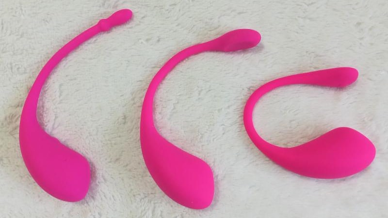
The first selling point was the flexible neck.
It was a good idea on paper, but when it came to stuffing the neck in your panties, it ended up having a slight bulge. One that was noticeable if you were wearing something very tight.
The new neck is firmer (not meant to be adjustable). It will curve with the body, hide the end result better, and (from my experience) help keep the toy in place better.
SIDE NOTE: Maybe this will also help cam models remember that they shouldn’t SWING THE TOY AROUND BY ITS NECK and then wonder why it breaks a few uses later. Sigh.

LUSH 3 BY LOVENSE – THE GUTS
As always, the three toys went through motor upgrades – even small improvements can feel massive when it’s turned on.
The Bluetooth range is improved. However, keep in mind that if you’re sitting across the room with your legs crossed and a hundred people between you and the controller, it will still have connectivity issues. So, it’s better to switch to long-distance control.
I’m not an engineer, but the boys in tech tell me the “parts” are better. Honestly, I didn’t understand half of what they said, but it sounded good.
There are also the standard programmable vibrations (x10) and all the bells and whistles that come with the dedicated app. From what I hear there are also improvements and/or changes to the cam-model aspect (software and installation etc.)
LUSH 3 BY LOVENSE – CONCLUSION
It’s interesting to know that all of these changes that have taken place over the years have come directly from customer feedback. So, if you have any more suggestions for the next generation of Lush (or any other Lovense toy), don’t be afraid to contact customer service and share your ideas. It’s good to know they’ll actually end up in the R&D meetings.
Want to upgrade? Lush 4 is out with new and improved features! Visit the Lovense Store for Lush 4 discounts.


